
本文和以前的文章类似,orange 尽量带给大家分享实际项目中的坑怎么填,当然只是提供思想,方法很多欢迎讨论,还有就是对于刚上手前端的新人不是特别友好,没关系,涉及到基础知识我会对应的进行指引,给出链接或给出提示,大家可以自行 Google(百度)。
说到行内对齐大家可能会想到类似水平对齐,垂直对齐总结类型的文章,既然我们叫 黑魔法 就不会是基础的对齐教程,基础教程的文章好多,大家想必都知道多种方法实现对齐
项目背景
还是 orange 所在公司的移动端项目,上案例

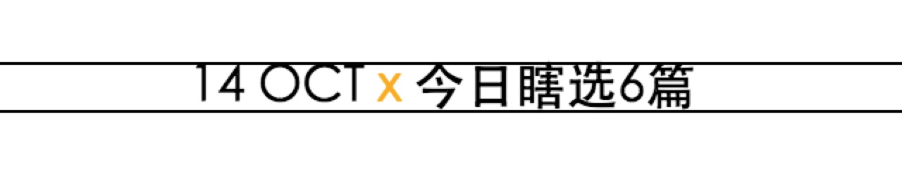
截多了,咱们只看第一行的文字,算是每一天都有的 title,有人说: TMD 你在逗我?这有什么可讲的谁都会写好不好!
先别激动,我当然不是解释这个布局怎么实现的,简单的例子更容易解释问题,继续往下看初步实现的代码,
1
2
3
4
5
6
7
8
9
10
11
12
13
14
15
16
17
18
19
20
21
22
23
| <div class="date-wrap">
<span class="date">14 OCT</span>
<span class="multiple">x</span>
<span class="desc">今日瞎选6篇</span>
</div>
<style type="text/css">
.date-wrap {
width: 100%;
height: 60px;
position: relative;
text-align: center;
line-height: 60px;
font-size: 18px;
font-weight: 600;
}
.multiple {
color: #f8ac08;
}
</style>
|
截图如下

细心的朋友看出问题了,看不出也没关系,我们加两条辅助线嘛!
1
2
3
4
5
6
7
8
9
10
11
12
13
14
15
16
17
18
19
20
21
22
23
24
25
26
27
28
29
30
| <div class="date-wrap">
<span class="date">14 OCT</span>
<span class="multiple">x</span>
<span class="desc">今日瞎选6篇</span>
<div class="line-top"></div>
<div class="line-bottom"></div>
</div>
<style type="text/css">
.line-top {
width: 100%;
height: 1px;
position: absolute;
left: 0;
top: 21px;
background-color: #000;
}
.line-bottom {
width: 100%;
height: 1px;
position: absolute;
left: 0;
bottom: 21px;
background-color: #000;
}
</style>
|
效果如下
好,相信大家现在一目了然存在的问题了,那就是前面的 date 并没有垂直居中,原因呢!解释起来也简单
这里只需要修改一行代码就能回答大家的疑问
1
| <span class="date">14 OCT orange</span>
|
将上文对应 html 修改后,得到截图
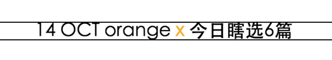
这个让我不禁想起了小学英语作业本的四线格,哈哈,大写字母的确都在上方的两个格,而小写上中下都有例子,单独看 g,很好解释上面的显现了吧。
看似简单的案例还就是这么特殊,恰巧都是数字和大写字母,细心的还会发现后面的 6 也有问题,一不留神,不居中了,设计来找你,你一脸蒙逼的说我是按照居中写的啊,解决不了了?
不是的,我们接下来就是解决这个问题的,现实项目要更复杂一些,有经验的前端知道字体间的差异,个别的字体上下相差特别悬殊,
这里前后的字体是不同的,但幸好垂直方向的差异不是很大,这里我引入了项目原有的字体,中间的 x 其实是个 svg 这里不赘述。因为看懂思想再来一百个不对齐的你也能迎刃而解。
进入真正的魔法世界,针对此案例给出两个思路大家自行选择
inline-block 魔法
不一步一步解释,直接上已经解决问题的代码
1
2
3
4
5
6
7
8
9
10
11
12
13
14
15
16
17
18
19
20
21
22
23
24
25
26
27
28
29
30
31
32
33
34
35
36
37
38
39
40
41
42
43
44
45
46
47
48
49
50
51
52
53
54
55
56
57
58
59
60
61
62
63
64
65
66
67
68
69
70
| <div class="date-wrap">
<div class="date">14 OCT</div>
<div class="multiple">x</div>
<div class="desc">今日瞎选6篇</div>
<div class="line-top"></div>
<div class="line-bottom"></div>
</div>
<style type="text/css">
@font-face {
font-family: century-gothic-bold;
src: url('century-gothic-bold.ttf');
}
@font-face {
font-family: FZYouH_512B;
src: url('FZYouH_512B.ttf');
}
.date-wrap {
width: 100%;
height: 60px;
display: flex;
position: relative;
flex-direction: row;
align-items: center;
justify-content: center;
text-align: center;
line-height: 60px;
font-size: 18px;
font-weight: 600;
}
.date {
font-family: century-gothic-bold;
}
.multiple {
margin: 0 10px;
color: #f8ac08;
}
.desc {
font-size: 16px;
font-family: FZYouH_512B;
}
.line-top {
width: 100%;
height: 1px;
position: absolute;
left: 0;
top: 22px;
background-color: #000;
}
.line-bottom {
width: 100%;
height: 1px;
position: absolute;
left: 0;
bottom: 22px;
background-color: #000;
}
</style>
|
效果如下
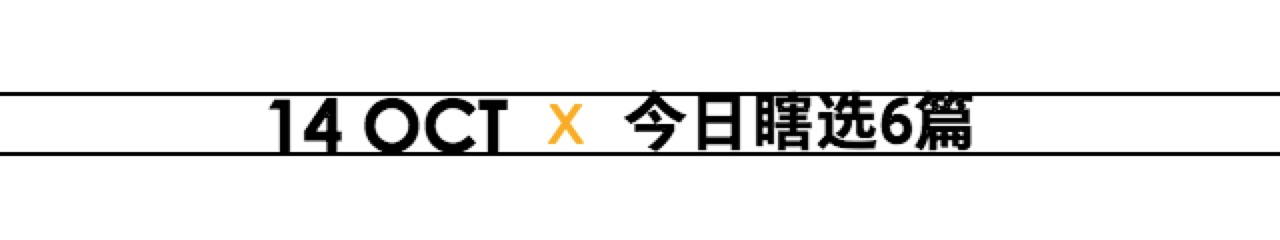
好棒啊,我只改变了后面文字的 font-size: 16px; 解决问题了耶,高兴的拿给设计师,对比之后返工了,
what fuck?什么鬼?心中一万个草泥马(神兽)奔腾而过,仔细看!瞪大眼睛。。。。没错
今字的上头出了我们的辅助线,设计师也会将手机截屏然后对照原稿做辅助线对比的哦~
解决办法相当简单,只需要
1
2
3
4
5
6
| .desc {
margin-top: 1px;
font-size: 16px;
font-family: FZYouH_512B;
}
|
只需要加一行,当当当当~
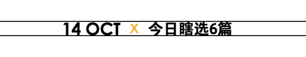
嗑嗑,凑合这样吧,为什么?明明对齐了啊!再仔细看,我是认真的,没玩大家,发现我们的 date 低了不到一个像素(使用 Retina 屏幕的朋友看的明显些),有人问一像素以内可以调整嘛?明确告诉大家可以,之后的文章准备做解释,这里不展开
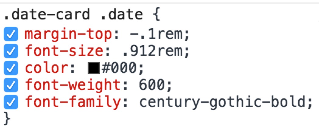
第一种方案到这为止,上手试验的朋友虽然没有我的字体,你不必去下载,浏览器默认字体一样的,我们讲的是原理,没必要还原我的 demo,关键就是 block 元素的上下 margin 调整。
提醒:这里的 margin 可以设置负值,如果负值无用自己去探索原因吧,给大家线上项目的控制台
我这里给的就是负值,是有作用的哦,可以去 敢玩移动端主页,记得在模拟器里查看(不然会乱成一锅粥),控制台一看便知,不过多解释啦。
vertical-align 魔法
完整代码如下
1
2
3
4
5
6
7
8
9
10
11
12
13
14
15
16
17
18
19
20
21
22
23
24
25
26
27
28
29
30
31
32
33
34
35
36
37
38
39
40
41
42
43
44
45
46
47
48
49
50
51
52
53
54
55
56
57
58
59
60
61
62
63
64
65
66
| <div class="date-wrap">
<span class="date">14 OCT</span>
<span class="multipl)e">x</span>
<span class="desc">今日瞎选6篇</span>
<div class="line-top"></div>
<div class="line-bottom"></div>
</div>
<style type="text/css">
@font-face {
font-family: century-gothic-bold;
src: url('century-gothic-bold.ttf');
}
@font-face {
font-family: FZYouH_512B;
src: url('FZYouH_512B.ttf');
}
.date-wrap {
width: 100%;
height: 60px;
position: relative;
text-align: center;
line-height: 60px;
font-size: 18px;
font-weight: 600;
}
.date {
font-family: century-gothic-bold;
}
.multiple {
color: #f8ac08;
}
.desc {
vertical-align: 1px;
font-size: 16px;
font-family: FZYouH_512B;
}
.line-top {
width: 100%;
height: 1px;
position: absolute;
left: 0;
top: 22px;
background-color: #000;
}
.line-bottom {
width: 100%;
height: 1px;
position: absolute;
left: 0;
bottom: 22px;
background-color: #000;
}
</style>
|
以上代码运行效果和之前一摸一样这里就不一一截图费大家流量啦(良心前端。。。。)
和上一个方法区别在于我们行内元素还用之前的 span 标签。然后通过 vertical-align: 1px; 来调节垂直方向上下的位置。对这个属性不熟悉的朋友可以去看MDN的文档:https://developer.mozilla.org/en-US/docs/Web/CSS/vertical-align
几种语法如下
1
2
3
4
5
6
7
8
9
10
11
12
13
14
15
16
17
18
19
20
21
|
vertical-align: baseline;
vertical-align: sub;
vertical-align: super;
vertical-align: text-top;
vertical-align: text-bottom;
vertical-align: middle;
vertical-align: top;
vertical-align: bottom;
vertical-align: 10em;
vertical-align: 4px;
vertical-align: 20%;
vertical-align: inherit;
vertical-align: initial;
vertical-align: unset;
|
我们用的这个 <length> values 长度单位实际应用较少,却是行内元素垂直对齐的黑魔法。不了解的不要紧,赶快 get 新技能
总结
两种方案都可行,有时候不要因为一像素绞尽脑汁,找到突破口,以后谁还会怕行内对齐了呢?
你们还有更好的想法吗?欢迎交流